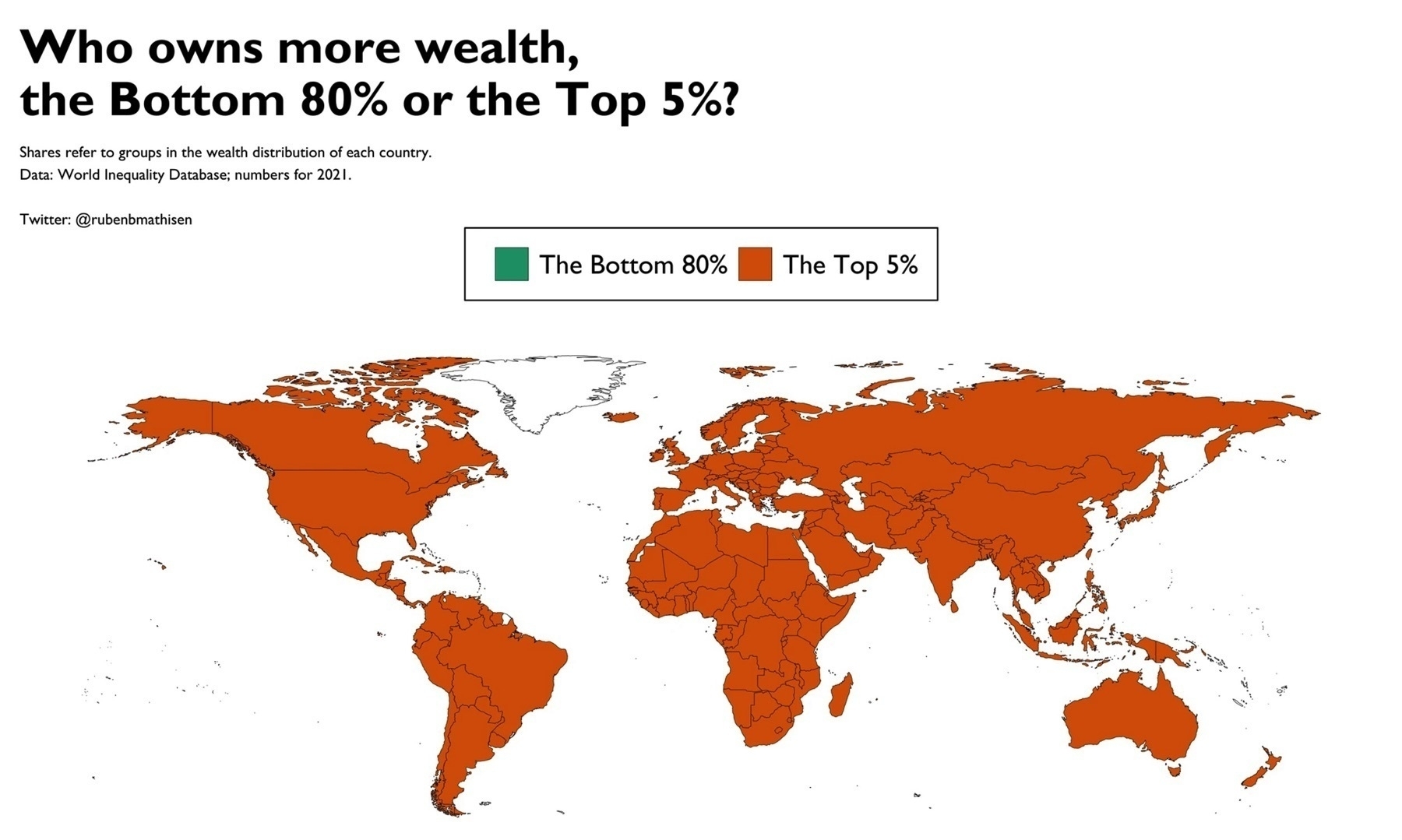
He also has this striking map showing countries coloured depending on if most of their wealth is owned by the bottom 80% or top 5%. (Luckily in this map New Zealand and Australia were not left out… still not suprised though)
From www.rubenmathisen.com/blank-2